Wednesday, December 11, 2013

Ice

Natural ice formations are one of the most amazing things in the world, in my opinion. The one above is one of the coolest ones I've seen, not because of it's shape, but because of the way it is photographed. The way the sun is shining through illuminates the detail of the ice and makes it appear to shimmer. I can't find anything I dislike about this photograph. It can be viewed at the following URL:

http://www.antarctica.gov.au/living-and-working/stations/davis/this-week-at-davis/2011/this-week-at-davis-26-august-2011

Great Wall of China

While not completely natural, the Great Wall of China is one of my favorite topics for photography. The above image is one of the better pictures I've seen of it. First, I really like how the greens and blues add a sense of depth to the image. The colors allow for the focus to be on the structure. While there are beautiful mountain peaks in the background, they simply serve as a nice background in this picture. I also really like how the wall leads the eye throughout the image from that lower right corner and back. The image can be seen at the following URL: 
http://pictures.4ever.eu/buildings/historical/great-wall-of-china-150741

Power of Perspective

This image is amazing to me. Usually, any wildlife in an image instantly becomes the focus simply because it is wildlife. However, in this image, it takes a while to notice there are a bunch of elephants in the lower third. The contrast is great in this. I love how the trees make the elephants look so small. This image can be seen at the following URL:
http://www.worldculturepictorial.com/blog/content/african-elephants-dwarfed-acacias-kenya-photo-2009-sony-world-photography-awards

Tornado Photography

One of my favorite movies growing up was Twister. Naturally, one of my favorite photography categories would be tornados! The National Geographic website has a multitude of tornado images, some of which can be seen at the following link:
http://environment.nationalgeographic.com/environment/photos/tornado-general/

Happy storm chasing!

Shocking Sunflowers

The image located at the following link is one of my favorite images I've ever seen. The blues of the sky, illuminated by the lightning, create a great contrast with the yellow of the sunflowers. I really love how the lightning strike is in perfect focus while those sunflowers are blurred, adding to the intensity of the photo.
http://www.stanroseimages.com/photo/sunflower-b/

Bill Atkinson

Bill Atkinson is a popular nature photographer. His images are of very high quality. He has many images available from the United States. I particularly like his images of rocks. He uses the lines and colors very well. Some of these images can be viewed here: http://www.billatkinson.com/GenerateCatalog?page=0&filter=_Rocks

www.billatkinson.com has galleries and options to purchase his images.

NANPA

The North American Nature Photography Association (NANPA) has an awesome website to find some great nature photography from North America. The website includes things such as showcases, publications, and opportunity to enter original work to the next showcase. For someone interested in nature photography, NANPA would be a great place to become a member and learn more. www.nanpa.org

Tuesday, December 10, 2013

Critique of 10 Peers' Images.

1) Jon Brunn, Image 7 of 30. I really like the focus and detail in this image. The detail in the feathers is an especially attractive feature of this photo. I think I would like the photo more if it were cropped on the left. In my opinion, it may be a more interesting image to look at if the duck were more to the left looking inward. The feet aren't completely in focus but that isn't a huge deal with this image.

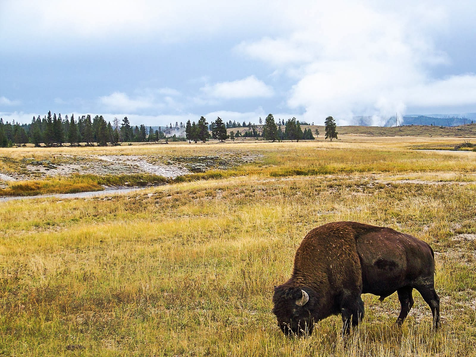
2) Brandon Haggard, Image 21 of 25. I really like that there are 3 bison in this photo. I especially like that they are all looking inward. One of my favorite aspects is that you can see the steam of the animals' breaths. It is unfortunate that only two of the three are lit by the sunlight. The lighting sort of puts that third bison in the background. If I were editing this, I probably wouldn't have cropped in quite as much (if possible). However, I think this is a very good picture of bison.

3) Zach Witt, Image 4 of 30. This is a great landscape picture. I really like the layers. I like how the meadows in the middle are nicely lit while the clouds are darkened so they aren't overbearing. I really like the color as well. Landscape images are easy to mess up with on the color but this image looks like it would in person. I might have cropped in from the right to get some of that tree in the lower right out or partially out of the image.

4) Tyler Reed, Image 3 of 30. The focus in this photo is well done. The background is out of focus, allowing the viewer to dedicate his/her focus to what is most important in the photograph. I might have cropped off some of the left portion so that the subject wasn't looking out of the frame. I like how the color of the background really complements the coloring of the subject. This is probably the best image Tyler Reed has ever had the pleasure of capturing and editing.

5) Melinda Obritschkewitsch, Image 24 of 30. I really enjoy looking at this picture. I like how the branches pull you through the picture in a circle. I also like the green moss down in the lower left. One thing I don't really like, which is somewhat unavoidable, is the bright yellow leaf right in the middle. It is sort of distracting. The contrast is nice in this picture.

6) Nathan McKenty, Image 3 of 30. I really love the blurred trees on the sides of this image while the landscape in the background is in focus. It adds that interesting element of movement. I like how the sky is darkened out. However, I wish the focused portion was more bright. The photo seems dull, overall. Perhaps more contrast and vibrance could help with this issue.

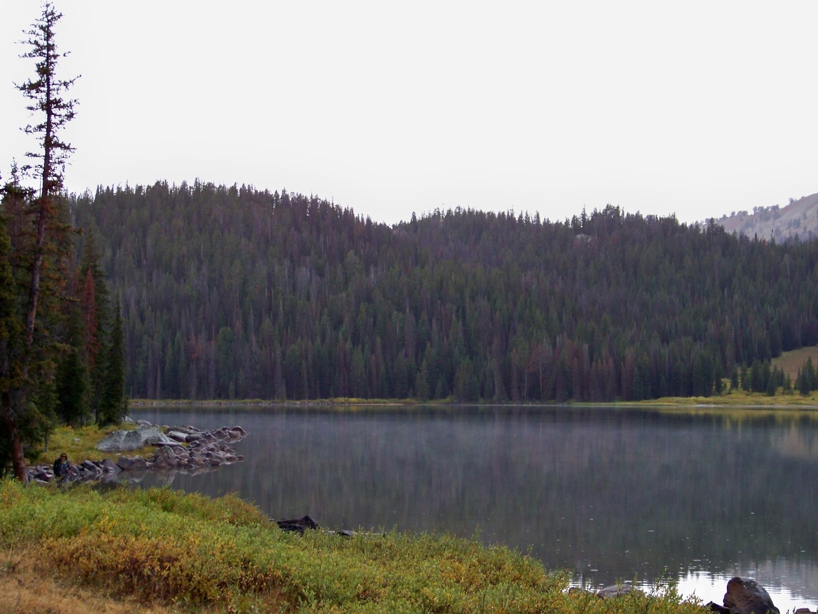
7) Anton Larsson, Image 13 of 30. This is a really great reflective image. I really like how the reflection is slightly distorted by the water, but it is still fairly clear. I really like the color in this image. It looks as if a graduated filter may have been used. If not, either way, the sky is a really good color and it's not overbearingly bright.

8) Tiffanie Pope, Image 12 of 30. I really like the simplicity of this image. I think black and white was a very good choice. I like how the silhouettes are in pretty good focus, but the wings are slightly bird. It gives a good element of motion. I also like how Tiffanie used the rule of thirds and placed the birds in the right third and it looks like they are flying inward in the image.

9) Nancy Robinson, Image 5 of 31. I really like this image as a whole. I really love how the water is blurred out nicely, giving that element of flow. I also really like how trees fully frame each side of this image. It is nice that most of the snow is not blown out, and the trees in the background have good lighting. This image has great layers as well, which contribute to its overall appeal.

10) Shelby Jurewicz, Image 14 of 30. The focus in this image is spot on. You can see the details of the eagle perfectly while the background is blurred out nicely. It is good that the bird's eye is in the upper third area, putting it in a good subject location. I would like to see more background. The eagle takes up too much of the frame. However, that may have not been a possibility. You never know what distracting object lies just beyond the crop line.


Thursday, December 5, 2013

Final Presentation Images


These photographs were all taken with either a Kodak Easy Share Z1012 IS or an iPhone 5S camera, both of which have fully automatic settings.

Tuesday, November 26, 2013

Photograph Critique

 Image 1: At first glance, the diagonal lines created in this scene make it a very attractive image. It is awesome how the clouds appear to be "overflowing" over the edge of the hill. I would have cropped in from the left a bit because those little clouds right on the left edge are somewhat distracting from that nice flow. There is some sort of tower toward the middle of the image on the top of that hill. That is distracting. If at all possible, I would like to see that taken from the image. I like how there is a very warm color at the bottom of the image from the natural sunlight and it works its way into a cooler color up in those blue clouds. The sidelight in this image really aids in this picture in making it more attractive and interesting to look at.

Image 2: I was immediately turned off from this image because of the focus used. I understand the idea and I think I can see what the photographer was going for, but all of that blurry foreground is quite distracting in my opinion. This photograph would really benefit if the bottom 1/3 was cropped out. leave just a bit of that blurry foreground but not much. I do like how the rough surface of that rock contrasts with the smooth background and foreground. I also like the color contrast between the blues of the background and foreground and the greens and yellows of the rocks.

Image 3: I love how the eyes and the feet of the squirrel are in focus. It adds an element of intensity to this image. Usually, an image is more attractive if the focus follows the rule of thirds. However, I like how the focus in this one is right in the middle. I think it looks good because the background is completely out of focus. I'm not sure how I feel about the protruding stick at the bottom of the image. In one sense, it allows the viewer to see what the squirrel is jumping at. However, it is slightly distracting from the overall image. I think if this were mine, I would crop the stick out. This is just a personal preference.

Tuesday, October 1, 2013

Gotta Critique Dem Pix

1) One of the first things I noticed about this photo is how the bear's eye is in clear focus. I like how the water in the background is blurry. It keeps your focus on the bear and fish. I like the angle that the fish is at and how you can see its eye as well.

2) I really like how the foreground in this picture is in good focus. Those bright yellow leaves against the rock has a really interesting appeal in my opinion. I like how the water is blurred out. I think the picture is better off that way because your eyes can focus more on the other aspects of the pictures, rather than the water. It makes the picture seem more calm. I like how off in the background, the yellow trees all sort of blend together to make a pretty background that isn't distracting.

3) Usually I don't like when any part of a picture is blown out, but with this one, I really do like how that upper right corner just fades to a white. It adds a very abstract feel to the overall picture. I like how the rocks look wet but are not blown out... I wonder if there was a graduated filter used with this? Another aspect that I really like is how the water flows diagonally from bottom left to upper right. Diagonal lines are interesting in a photograph.

4) I really like the sky portion with the clear stars. One thing I do not like is the cloud cover over the mountains. I think it is distracting since it is so blurry. I do like it over the sky portion. I really love the lighting with this. I love all the detail on the mountains.

5) I think the bottom portion on this, with the big thermal feature, could use more color. It doesn't seem to pop out like it should, in my opinion. I think you could crop some of the left portion of the picture off to make it flow a little better. You could crop some of the right portion as well. I do like how clear the trees in the background are.

6) I really like the color contrast with this picture. The blurred background is sort of a dull color which allows the red and yellow of the bird to pop even more. The color of the twig really goes well with the yellow of the bird too. I like how the bird has red on it's face... Since red is such a striking color in photographs, it really draws your focus in to the birds face. I like how the two in-focus twigs sort of frame the bird.

7) This photograph seems really noisy to me. Too much is in focus. I think it would benefit by having the water out of focus and maybe the background more out of focus as well. The moss is cool to look at but it distracts from the bear, which should be the main focus of the photograph. The water is very distracting in the foreground. When I look at this image, my eyes don't really know where to go.

8) The color in this photograph is very interesting. I really like how the moose is standing in that field of red. Again, since red is such a striking color, it brings your focus to that moose. I really like how the sky portion fades from that bright orange/yellow to the dull cloudy blue. I also like how the two mountain peaks are different colors. It adds a sense of depth which I find very appealing.

9) I love the intensity of this photograph. The eyes of the bird are in focus which allows you to get that sense of intensity. I like how the wings are slightly blurred... It adds a sense of motion to the photograph. I also like how the wings sort of frame the birds head. I like how the only portion that is in focus is the bird and a little bit of the water. If anything else were in focus, it would be too distracting.

10) I really like the angle that the bear in the front is at. Your eye immediately goes to it. I kind of dislike having the other bear in the background though. I think the picture would look good if it were cropped in just between the two bears so that only the front bear would be in the frame. I prefer more simple pictures and having that other bear in the background provides too much to focus on in this picture. 


Thursday, September 26, 2013

YNP Color

Here is one of my favorite images I took in Yellowstone National Park. This has been slightly edited to allow those colors to pop more and cropped to get rid of a couple distractions. I like the pine right in front that is slightly out of focus. I think it adds an interesting aspect of depth to the picture.

Monday, September 16, 2013

These are some of my favorite pictures taken in Yellowstone National Park this weekend (9/14 and 9/15/13) that I hope to edit in the near future. None of these have been edited yet. I'm happy with the variety of styles and subjects I have in this group of pictures and am excited to edit them.